TJ Maxx App
Heuristic Analytics & UI Redesign
Role: UX/ UI Designer
Timeline: 2 weeks
Team: Lynda Irawaty, Hilal Ozkaya, Gerard Gomilla
The Story
T.J. Maxx is one of America’s largest department chains with over 1,200 stores nationwide. Yet, despite its scale and success, T.J.Maxx failed to offer a satisfying digital product and experience.
The app rating is fairly low compare to its competitors. Their customers are frustrated with the overall experience, and they found shopping with the app is not as user-friendly as going to the real store.
The Evaluation
We evaluated the problems based on Jakob Nielsen's 10 general principles for interaction design called Heuristics. It is considered the best practice to follow to ensure your final design is usable.
The higher the score on the severity scale, the more severe the usability issues are. While scores between the 1 to 2 range indicate a small usability problem, violation scores in the 3 to 4 range indicate that the current design is major and catastrophic and the typical user will most likely abandon the task because they can’t complete it.
The Analysis
After analyzing each flow of the app, we found a total of six (6) violations under the Discover flow.
We redesigned recommendations to improve the usability for each violation.
Consistency & standards
Aesthetic & minimalist design
Help & documentation
User control & freedom
Match between system & real world
Flexibility & Efficiency of use
Task Focus
Let’s begin by understanding the User flow showing the path needed to be taken by users to find products/ shops that match their style.
The Redesign
Discover / Home
The Home page has a lot of things going on, to give a clear hierarchy of information will give users more focus to complete their task.
Reducing users’ cognitive load is important, we could do this by maintaining consistency of style in text, CTA, and icons.
Discover / Maxx Matches
TJ Maxx branded Maxx Matches as a curator that helps discovers products/ shops based on the styles users love, but the current experience failed to meet the expectation.
We redesigned the experience to add more style customization, fix unnecessary redundancy and errors.
Shop / Product listing page
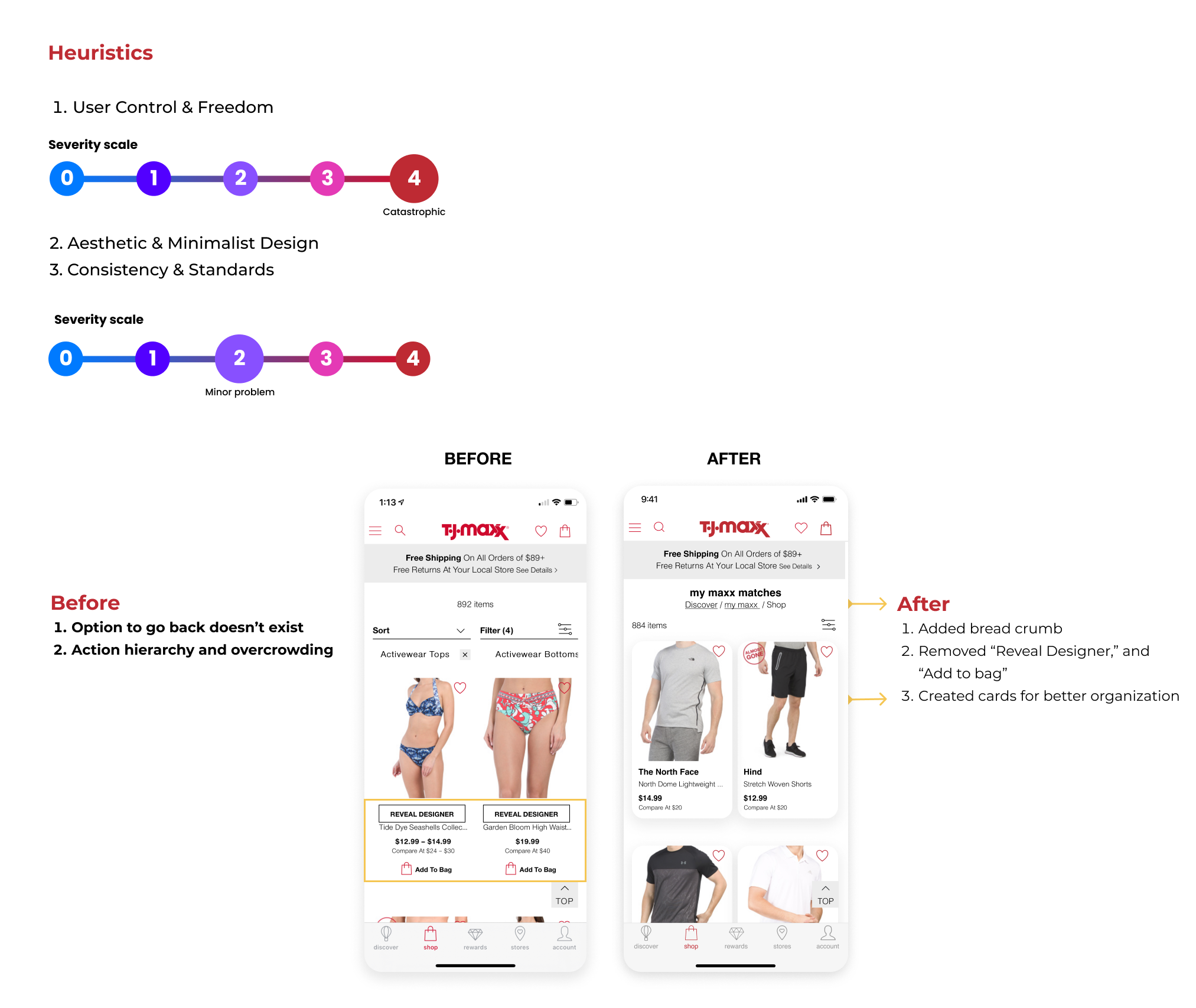
Immediately we are seeing an Action hierarchy issue, the main CTA button looks to be “Reveal Designer” rather than “Add to Bag”.
This causes confusion for users while adding an extra step. Some items don’t even have the “Reveal Designer” button, causing a consistency issue.
Also “Add to Bag” CTA is not necessary at this point because users will want to go in the product listing page detail first, then if they want to buy it, then add the item to the bag.
To have a better aesthetic and minimalist design, we removed those buttons and add cards to better organize information.
Reducing the cognitive load the user needs for achieving his goals is of the utmost importance when designing for humans.
Shop / Filter
The shop results need to be filtered to fix preferences. After we improved the overall experience, selecting the men category should not be resulting showing female products anymore, but we added a filter for Departments that could easily sort between men's or women’s products.
We added more filters for pattern, color, material, brand, department, and product style to align with the new experience.
Shop / Help
Ensure that help documentation is easy to search and whenever possible, present the documentation in context right at the moment that the user requires it.
Summary of Redesign
Modified the overall style to have consistency, hierarchy, and minimal aesthetic
Help section moved for easier access
Redesigned the my maxx matches for a customized and real-world experience
Filters were developed for more efficiency of use
The Next Steps
After the redesign proposal was approved, we provided the following:
Provide User Interface Library for redesigns
Collaborate with the developers to launch product redesigns
Measure Return on Investment (ROI)
App ratings
Customer feedback
KPIs of my maxx matches, clicks, and purchases
If you made it this far, thank you 😊
I’d love to hear from you
I’m open to any project or feedback!


